Tour Every Rom of the Kips Bay Decorator Show House Dallas 2022
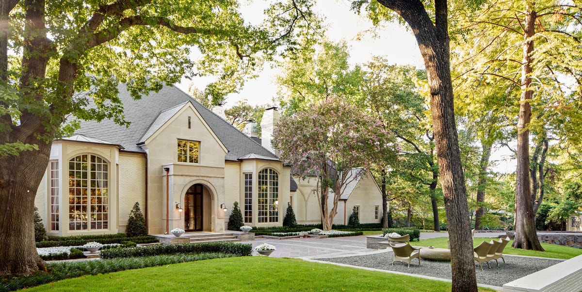
Welcome to the most social Kips Bay Decorator Show House you’ve ever experienced, as the design event makes its triumphant return to Dallas. Whimsical patterns, vibrant jewel tones, and soirée-ready spaces invite a convivial brand of southern charm into the home that’s anything but old-fashioned. And those are only a few of the exuberant, indulgent schemes awaiting at the historic Old Preston Hollow estate, where 24 top design firms from across the country have worked together to transform the 12,470-square-foot house. Inside, discover a deep connection to the surrounding landscape; transportive, travel-inspired décor; and hospitality around every turn. And, for when the party’s over, soothing, restorative retreats abound as stylish places to unwind.
The third-annual Kips Bay Decorator Show House Dallas is only open from Thursday, September 22 through Sunday, September 25. First access tickets for September 23-24 start at $125, and general admission tickets for September 25 start at $40; all proceeds benefit the Kips Bay Boys & Girls Club as well as Dallas-based Dwell with Dignity and The Crystal Charity Ball.
Here, take an exclusive look inside the 2022 Kips Bay Decorator Show House with these photos of each room and learn what inspired each of the designers.
More From Veranda

Jean Liu Design’s “Nothing Nowhere All at Once”
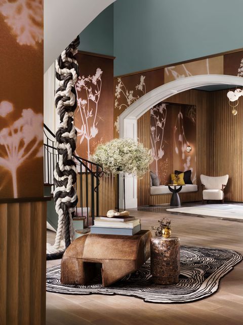
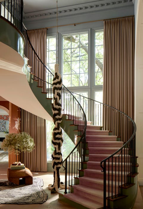
“Warm, modern, and dramatic,” says Dallas-based designer Jean Liu of her vision for the grand foyer. As guests step through the front door, the hand-blown glass globes of Larose Guyon’s modular brass chandelier cast a warm glow over the entry’s white oak-fluted walls and inviting built-in bench seat. However, the demure introduction quickly extends a Texas-sized welcome as visitors step into the voluminous foyer, anchored by an open double-height staircase.
“A beautiful medallion on the second-floor ceiling screamed for a statement piece, and we wanted to try something modern and unexpected,” says Liu, who chose an over-13-foot macrame sculpture by Mexico City-based artist Emma Boomkamp (from Garde) as the pièce-de-résistance. “It turns the traditional home’s entry on its head,” she notes. The floor-to-ceiling wool Holland & Sherry draperies by The Shade Store deliver additional drama while highlighting the windows’ architectural details.
Liu wrapped the foyer in a warm, sepia-toned botanical wallpaper by Fine & Dandy Co., juxtaposed with cool blue-gray upper walls and ceiling (Mount Saint Anne by Benjamin Moore). As the painterly floral pattern extends down the primary hallways, it’s punctuated by modern Holly Hunt sconces and white oak fluted paneling. Even the elevator exudes modern luxury, with wool upholstered walls, white oak casing, and aged brass handrails.
Christina Kim Interior Design’s “3 A.M. Dream”
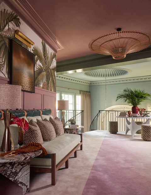
New Jersey-based designer Christina Kim turned the staircase and landing area into an opportunity to whisk visitors away to a far-flung tropical locale, with filmmaker Wong Kar-Wai’s In the Mood for Love serving as inspiration. “It’s not so much about using the same saturated color palettes, as he often does, but more about capturing the mood and ambience he sets so well in his films. They are romantic, mysterious, and tell a story of their own,” says Kim.
The transportive landing features an Anobô mural with lush, billowy palms and a seductive forest-green-and-rose palette. A crowning five-foot-wide rattan light fixture recalls a thatched umbrella canopy, and an ombré lavender carpet Kim created with The Rug Company unifies the destination-worthy seating area’s palette. Alongside a vintage-inspired bespoke sofa sits a center table she designed in collaboration with Aronson Woodworks while sleek side tables created from graphic Calacatta viola marble are by Il Granito.
Alessandra Branca’s “Foglia”
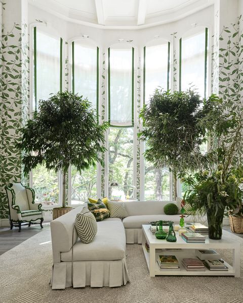
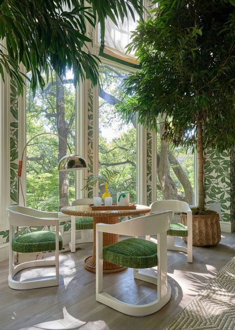
The verdant view outside the windows inspired Chicago-based designer Alessandra Branca to transform the sun-drenched living room into a flourishing, tree house-like extension of the garden. Though the sky-high ceilings posed a challenge, “We found a great way to celebrate the height with Casa Branca’s Foglia wallpaper,” she says. Inspired by an antique Korean screen, climbing tropical vines bring the home’s lush grounds indoors. Dappled sunlight filters through the romantic Roman shades, outlined in a green striéd trim (and fabricated by The Shade Store), that adorn soaring windows; a matching set of portieres dresses the doorways.
A sequence of engaging seating areas maximizes the living room space for entertaining. Surrounding a 1970s cerused oak-and-wicker table, four original white lacquered Karl Springer Onassis armchairs are upholstered in a green boucle mélange. “It’s a great place to sit and play cards, have an informal lunch, or hop on a Zoom call in your best light!” the designer says. Over the Strike mantel hangs an emerald Christophe Gaignon mirror, reflecting a Casa Branca skirted sectional covered in a creamy boucle by Perennials.
Additional cozy places to land include a set of vintage tartan-and-velvet oak club chairs and an 18th-century wingback chair refreshed with a green linen stripe and olive bullion fringe for a look that’s “new old-school,” notes Branca. A 1940s cerused oak bar with a green lacquered interior—a Paris discovery—is at the ready when cocktail hour calls.
Anthony Baratta’s Study
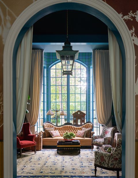
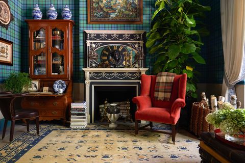
New York-based designer Anthony Baratta dialed up his signature American country house style to Lone Star State proportions in the first-floor study, a grand room that called for bold strokes of classic colors and furnishings. A career-long admirer of English decorating, Baratta turned to the late Queen Elizabeth II’s beloved Balmoral Castle, where, in her sitting room, he discovered the perfect tartan for reimagining into a vibrant custom wallcovering. “From there, the room became a take on an English decorating sensibility but on a blown-up American scale—as tall as Texas!” he says.
Baratta employed an audacious mix of upholstered pieces with neoclassical and English antiques. “I think the greatest decorating lesson young people can learn is how to use brown furniture, because it helps balance a room,” he notes. Even the accessories feel larger than life. A six-foot antique clock face hovers over a sofa, while a copper lantern from Newel descends from the tray ceiling painted dark teal (Benjamin Moore’s Yorktowne Green). Billowy draperies by The Shade Store feature royal blue Greek key trim. A 19th-century American mantel repainted to mimic a giant piece of Wedgwood’s Jasperware is another focal point, while an antique plaster bust of Hercules (from Baratta’s personal collection and found in Germany) holds court in the corner. As the designer says, “Go big and better to keep it simple, bold, and fun.”
Atelier Davis’ Primary Hall and Powder Room
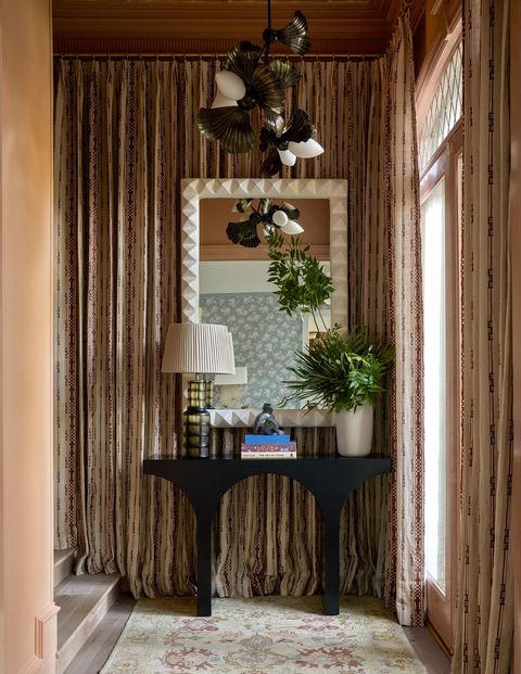
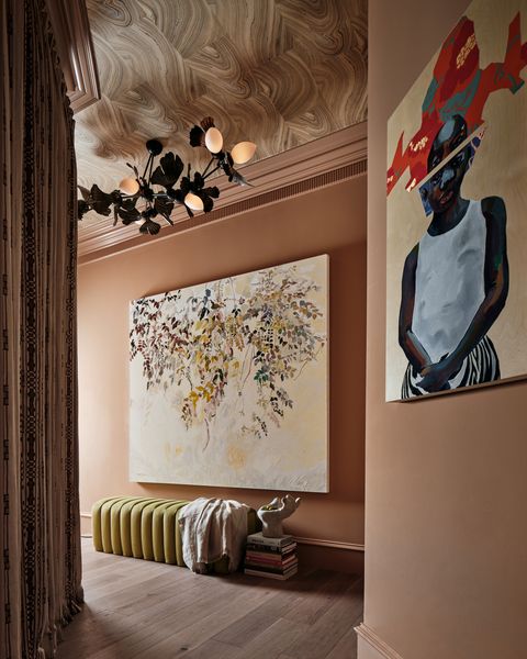
As an ode to her home state, Jessica Davis of Atelier Davis reflected the showhouse’s natural surroundings and Texas’ sherbet sunsets in the primary hallway and powder room. The Atlanta-based designer dressed the walls in a faded terracotta hue (Benjamin Moore’s Grazing Fawn) to mimic the dusky glow of late-afternoon sun pouring through the window. Her homage to the Lone Star State continues with York Wallcoverings’ iridescent Onyx print (reminiscent of native limestone) dancing across the ceiling, while in the vestibule, a stool dressed in chartreuse Perennials velvet and a painting of Texas flora by local artist Erika Huddleston nod to the property’s oak trees. Bronze ginkgo blossom pendants by Rosie Li Studio invite more organic beauty. “Enveloping the pass-through space in draperies turned it into a jewel box,” adds Davis, who chose a russet-hued abstract print by Brook Perdigon Textiles (fabricated by The Shade Store). Also in the hallway’s vestibule, an ebony-finished console table, topped with a hand-blown glass lamp and ceramic vase (all by OKA), juxtaposes a sculptural ivory mirror by Brent Warr.
As visitors progress down the hallway, the palette deepens like a setting sun into the powder room. A mélange of earthy red mosaic tiles wrap the walls; autumnal orange honed marble from Artistic Tile dresses the floor and vanity; and Benjamin Moore’s moody Mayflower Red coats the ceiling. The sculptural Rosie Li Studio sconce and a faceted glass sink by Kohler echo elements of water. The cerused white oak cabinet fronts are dotted with a quartet of petite black tubular knobs from Nest Studio Collection.
Natasha Baradaran’s “The Empowered Woman”
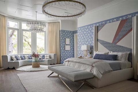
“I imagined a space that blends luxury and wellness together,” says Los Angeles-based designer Natasha Baradaran of the primary bedroom, which she describes as her love letter to womanhood. To give the sizable room a more intimate feel, the designer created a series of inviting spaces for its inhabitants to recharge. The Natasha Baradaran Collection Sole bed—“our modern take on color blocking,” says the designer—is outfitted in sateen linens and an ice-blue quilted coverlet (embroidered with Persian-inspired florals) from Peacock Alley.
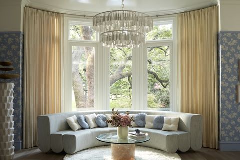
Additional spots to unwind—like a contemporary mint circular sofa in the bay window softened by tailored ivory draperies by The Shade Store—enhance this restorative retreat. Geometric lacquered ceiling panels by Fuller Architectural Panels juxtapose the blue-and-white lacey floral Giamba wallcovering from Baradaran’s collection. “I love the combination of something a little more feminine with something a bit more structured. It’s unexpected but, at the same time, tranquil,” she says.
Huma Sulaiman Design’s “Parisian Dream”
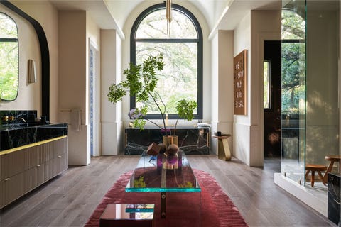
“Our goal was to seduce all the senses,” says California-based designer Huma Sulaiman of the primary bath. The space’s existing airy architectural details (like the arched window and vaulted ceiling) begged for glamorous, Parisian-inspired touches. Original wood flooring grounds the room in warmth, while an earthy plaster finish applied to the walls brings subtle movement.
Sulaiman balanced creamy Perlato marble—incorporated as fluted details on the walls and vanity—with sexy Verde Levanto marble on the tub and countertop, both from Stone Boutique. The elongated glass pendants’ brass details dance overhead, while a waterfall acrylic bench reflects the greenery outside a window left bare. Parisian-born artist Joseph’s Life Is a Show echoes the brass fixtures and fittings by Kohler.
Huma Sulaiman Design’s “Shaken Not Stirred”
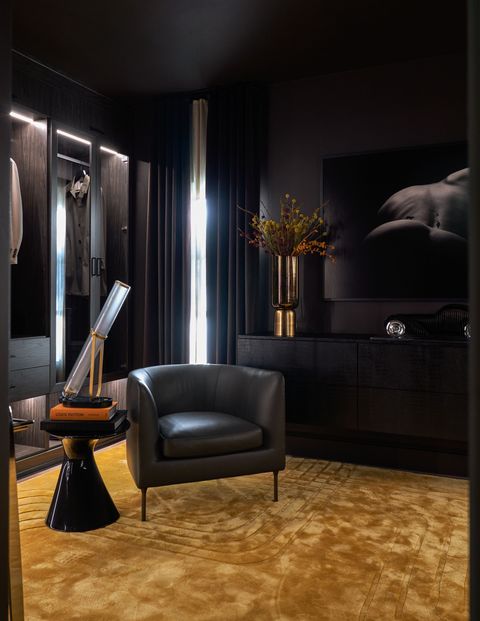
Sulaiman recalled a guestroom in Marrakesh’s El Fen hotel, with sultry black walls and a brilliant saffron rug, to conjure what she’s dubbed a “gentleman’s lair” for his closet. Along the walls, sleek midnight gray built-ins with integrated lighting from The Container Store’s Preston collection blend the functionality of a walk-in closet with the sophistication of a gentleman’s lounge. Sulaiman wheeled in a bar cart to give the space more functionality as a welcome destination for an evening aperitif.
As the primary bathroom’s seductive counterpart, the closet is cloaked in a black textural wallpaper and sumptuous brown velvet draperies (with a delicate sheer backing for the option of dappled sunlight) by The Shade Store. A console embossed with crocodile hide, a Bugatti sculpture by French artist Antoine Dufilho, and an alluring photograph by J. Léo contribute to the designer’s masculine vision.
Schooler, Kellogg, and Company’s “Her Dressing Room and Closet”
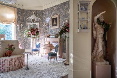
For the decadent dressing room, Dallas-based designer Ann Schooler of Schooler, Kellogg, and Company channeled the French Belle Epoque era’s aura of unabashed luxury. “Dressing rooms are about making yourself feel as wonderful as one could,” Schooler says. Discovering the twin hand-carved chinoiserie mirrors with white gesso finishes—reproductions of those stonemason Luke Lightfoot carved for the historic Claydon House—set her scheme into motion, complete with a blue-and-white hand-blocked linen wall upholstery. Luxurious accessories—the plush sheepskin rug, an embroidered bourne settee, and a blush Currey & Company vanity—elevate the space to a serene escape.
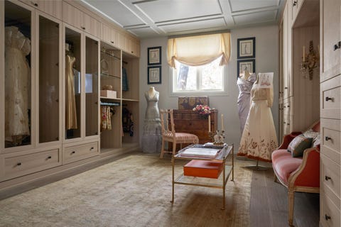
Around a corner, a jewel box-like closet by The Container Store (a Preston custom closet) presents a fashionable look at Texas history, filled with custom gowns by Dallas couturier Michael Faircloth. Delicately nestled into a niche, a sumptuous apricot French settee (crowned by an ornate Venetian glass mirror) offers the ultimate perch for slipping on stilettos before a fabulous evening out. Creamy silk tulip shades with sky blue chinoiserie trim (made by The Shade Store) lend a soft finishing touch.
Fisher Weisman Brugioni and Fisher Weisman Collection’s “Dinner at Eight”
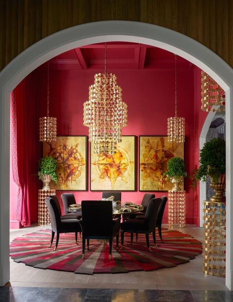
“One of the risks with the dining room is that, because it’s open to the whole house, it could feel like a big alcove amongst the other enormous spaces,” Jeffry Weisman of Fisher Weisman Brugioni and the Fisher Weisman Collection says. “Red made the dining room feel like a destination, and it delivers a sense of intimacy and specialness,” says the San Francisco-based designer, who coated a textural grass cloth wallcovering in a deep, sophisticated shade by Benjamin Moore. Even the bay windows are dressed for the occasion, with sumptuous wool Holland & Sherry draperies and embroidered trim (fabricated by The Shade Store).
And what’s an extravagant dinner party without convivial conversation? To set a social scene, Weisman paired an oval dining table atop a vibrant Art Deco-inspired starburst carpet of his firm’s design. “The decor makes you want to have a party,” he says. A dramatic steel-and-papier-mâché five-tier from the Fisher Weisman Collection along with gilded pendant and pedestal counterparts illuminates the whole scheme. “The glamour of gold against red is timeless.” As a finishing touch, a 24-carat Italian gold leaf tryptic with ink wash paintings by Andrew Fisher commands an entire wall.
Noel Pittman’s Laundry Room
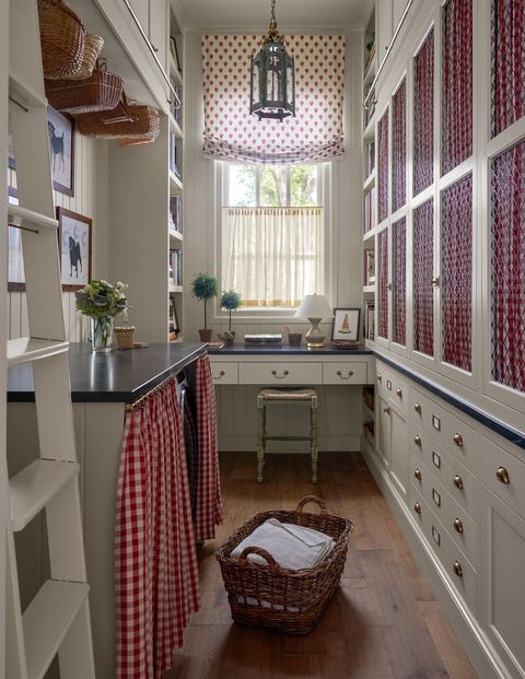
For native Texan Noel Pittman, bringing beauty to hardworking spaces makes household chores more enjoyable. “I thought, ‘What can I do to create a laundry room that’s inviting and comfortable?’” recalls the Dallas-based designer, who looked to utilitarian spaces by architect Gil Schafer for inspiration. Classic details such as tongue-and-groove cladding, brass cabinetry hardware by Armac Martin, and airy cafe curtains recall the spirit of the traditional Dallas homes Pittman admired from a young age.
The cabinetry is swathed in Benjamin Moore’s beige Chatsworth Cream and outfitted with a handsome library ladder for accessing out-of-reach storage. A whimsical Sister Parish Roman shade (fabric sourced at local James Showroom and shade fabricated by The Shade Store) dresses the window, while a cherry check by Schumacher fashioned into a skirt hides a washer and dryer. A pair of verdigris Colefax & Fowler lanterns light the space. Extending the Cambria Charlestown Matte countertops allowed for a workstation beside built-in bookshelves. Above a Kohler sink and faucet hangs a painting from Nick Brock Antiques.
Blaire Designs’ “Vista Do Jardim De Um Explorador”
The colorful, old-world allure of Portugal was too enticing for Nashville designer Blaire Murfree of Blaire Designs to pass up as inspiration for the rear mudroom. “My space was inspired by travels through Portugal: the regional artistries, the diverse terrain, the impacts of early maritime exploration, and the varied architecture that reflects the numerous artistic influences on the Portuguese culture throughout history,” she says.
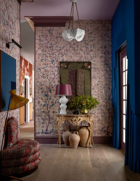
This is especially evident in her use of de Gournay’s Braganza wallpaper. The scenic, hand-painted garden scene features a grid-like effect that conjures Lisbon’s iconic tiles. “We customized it using warmer terracotta and aubergine tones with pops of the classic blue-and-white associated with Portuguese tiles,” says Murfree. Two doorways are dressed in brilliant turquoise lambrequins and draperies (fabricated by The Shade Store) as a nod to the formal window treatments from a hotel in Sintra, Portugal.
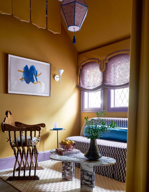
“As you go upstairs, we completely changed colors,” says Murfree of the landing’s mustard tented draperies. “I imagined the skylines and tops of buildings in Lisbon as you’re looking out to the water.” A settee, covered in Zak + Fox’s Japanese-inspired Obi fabric, a viola marble cocktail table, and an antique bone inlay chair complete the seating area, echoing Murfree’s juxtaposition of modern and traditional.
Shelley Johnstone Design’s “Garden View Study & Bathroom”
It only took a matter of seconds for Illinois-based designer Shelley Johnstone to devise her design plan. “I created the room using all of my favorite things,” she says. First, Johnstone covered the walls with a tidy chocolate brown ticking stripe fabric, even dressing the French doors with complementary draperies fabricated by The Shade Store, to create a casual yet timeless backdrop.
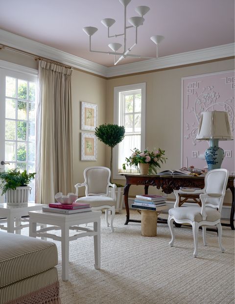
Next came the French antiques (like an elegant fruitwood writing desk), vintage rattan armchairs, and bespoke upholstered pieces. Contrasting textures like a glossy pink ceiling and plaster Julie Neill chandelier turn the room into “a somewhat feminine space that doesn’t take itself too seriously,” says Johnstone. A collection of artwork and photographs adds the final layer, most notably the framed plaster panel by Casci Ornamental Plaster. “I was inspired by the plaster relief details you see in beautiful European rooms,” she says.
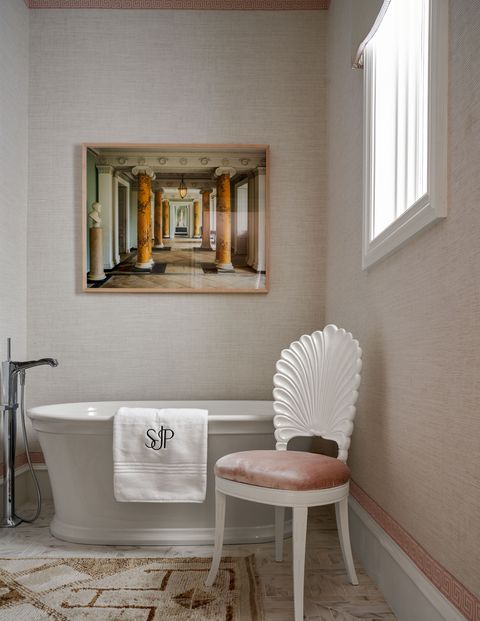
For the adjacent bath, Johnstone carried through the brown-and-cream ticking stripe on the pelmet (fabricated by The Shade Store). An ivory Phillip Jeffries grass cloth wallcovering is finished with pale pink Samuel & Sons Greek key tape along the trim and baseboards. Above a freestanding Kohler tub hangs an architectural photograph by Dale Goffigon.
Christopher Peacock’s “Kitchen Suite”
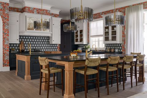
“This is an entertaining house—inside and out. I wanted to provide an environment for its residents to thrive,” says Kips Bay Decorator Show House veteran Christopher Peacock. To accommodate partygoers’ natural gravitation toward the kitchen, he installed two islands: one for prep and one for entertaining. Illuminated by a grid of metallic Arteriors drum pendants, both islands feature Cambria’s charcoal Montana Midnight Matte quartz countertops as well Hollinsbrook Matte, brass Kohler fixtures, and a blend of cerused oak with midnight blue cabinetry. To encourage lingering, Peacock outfitted the party-ready island with a sink that doubles as a beverage cooler, a JennAir wine refrigerator, and woven Serena & Lily counter stools to further distinguish the counter as intended for entertaining.
Dark and light tones continue playing off one another in the surrounding Lambourne cabinetry and burnished brass hardware (both part of Peacock’s collection), and pair brilliantly with a charcoal-and-white geometric Artistic Tile backsplash. A Cole & Son tangerine wallpaper, depicting baboon monkeys and chameleons sunning on flowering trees, brings playful contrast to the kitchen’s moodier scheme.
LC Studio’s “Midnight Lounge”
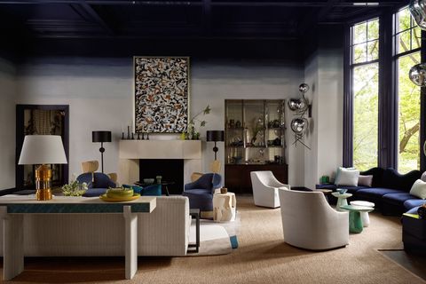
In the family room, dramatic bay windows practically begged for a banquette nestled beneath. From there, Lance Scott and Cecily Waud, the design team behind LC Studio, envisioned a moody cocktail lounge that would serve as the home’s central hub for entertaining. Like a coveted booth at a marquee club, a midnight-navy velvet banquette holds court along the window, with playful mushroom drinks tables from Maison Gerard accentuating the space’s party-ready look. To control the cavernous feel of the 15-foot coffered ceiling, the team applied a complementary navy lacquer (Benjamin Moore’s Old Navy); as the shade descends the walls, it fades into a pale gray.
A central seating area is positioned around a commanding limestone Strike mantel. “It’s a nod to traditional old limestone fireplaces, but this one is elevated and modern,” says Scott. A pair of Donzella chairs invite intimate fireside conversation and can pivot to face the Perennials-clad L-shaped sofa and cerulean suede MOUS wood-frame chairs, all set on an amorphous Tai Ping rug. Beside the fireplace, the duo transformed a former AV cabinet into a built-in bar with an eglomise backsplash, lavender resin shelves, and an antique cabinet.
Graci Interiors’ “Bon Vivant Hideaway”
New Orleans-based designer Chad Graci was eager to invite glamour into his renovated mudroom and bath, turning to the celebrity allure of 20th-century New York City nightclubs like El Morocco and The Stork Club. “Instead of designing a traditional mudroom, I envisioned a fabulous transition place where you’d steal away for a little respite from a fabulous party,” he says.
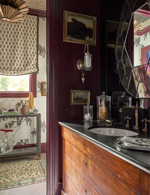
Gloss oxblood trim connects the hallway, clad in The Vale London’s Tassel Berry wallpaper, to the adjacent bath which features a vanity in Cambria‘s Mammoth Cave Matte. Gold vinyl wallpaper on the hallway’s ceiling lends a decadent touch, while window treatments featuring a paisley Namay Samay print from Wells Abbott with braided Samuel & Sons trim (fabricated by The Shade Store) provide additional visual interest. Nods to his hometown include pieces by New Orleans artists, such as a John Bobbitt watercolor, a Gene Koss glass sculpture, and a George Dureau photograph. “I like to bring together pieces of all eras and styles and textures into one strong message,” Graci says.
Isabel Ladd Interiors’ “La Terraza Tropical”
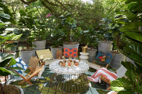
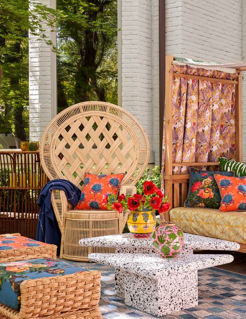
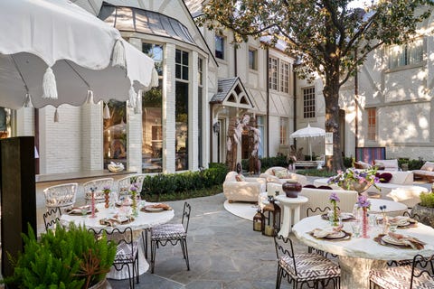
“As a Brazilian native who thrives in heat and sun, this outdoor terrace space hits close to home,” says Lexington, Kentucky-based designer Isabel Ladd. “I knew there would be a few non-negotiables in my design: a whole lot of yellow, a kaleidoscope of patterns, and surprises and details at every turn.” The designer brought her bold brand of curated maximalism to the terrace by, well, maximizing the square footage and devising four distinct nooks. “You give me one room, and I’m going to give you four,” jokes Ladd, who used color to unite the spaces.
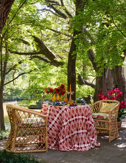
A teak Ballard Designs daybed debuts a custom outdoor fabric inspired by a graphic Ladd spotted on the invitation to the Kips Bay President’s Dinner. Set underneath a live oak, the shady spot becomes the ultimate retreat for alfresco naps. Also on the patio, a vintage rattan freestanding bar, which is decoupaged with CW Stockwell wallpaper, and an intimate dining area anchored by a wicker Ballard Designs table and rattan Serena & Lily chairs.
Down a pathway to the “cocktail kiki,” boat dock lies a Cambria-topped fire pit filled with bottles of rosé in a Kohler sink. Muralist Chera Creative painted the flooring in a pattern mimicking Peter Dunham’s Fig Leaf pattern. Tethered to the dock by a rope created from Samuel & Sons trim, a painted canoe (also by Chera Creative) was inspired by the designer’s favorite Brazilian-made Farm Rio dresses. “I love creating magic out of unexpected things in everyday life,” says Ladd.
Byron Risdon’s “Terrasse 107”
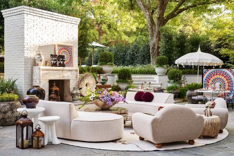
Washington, DC-based designer Byron Risdon let the lush patio’s existing hardscape lead when planning his sociable outdoor area. “The terrace’s rounded edges chopped up the space and initially presented a layout challenge, so I decided to lean into the curves instead of being afraid of them,” he says, noting the series of individual zones beneath the towering magnolia tree.
In the primary seating area, Risdon replaced the existing fireplace with Strike’s Laguna stone mantel, its rounded legs echoed by crescent sofas upholstered in a woven salmon-and-cream acrylic fabric by Perennials. The designer brought indoor comforts outside with plush armchairs and a Sacco area rug, along with Sutherland’s African white cocktail tables. Displayed on the mantel, Risdon collaborated with Abiera Dream to create a mosaic panel inspired by African American artist (and fellow Washingtonian) Alma Thomas.
A stroll through the terrace leads to a quiet, tucked-away corner anchored by a rattan Serena & Lily daybed for stealing away with a book. Beside the outdoor kitchen, a pair of Serena & Lily round, faux bois tables invite dinner parties under the stars. Risdon notes his favorite pieces are the Méandre side chairs by Design Frères. “The chair backs’ squiggly lines fit in perfectly with what I was trying to achieve, and the darker finish plays off the white stone tables,” he says. “It’s an elegant outdoor space designed entertaining in mind.”
Beauty Is Abundant’s “Intergalactic Superstar Bathroom”
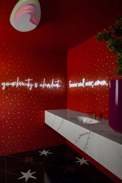
Atlanta- and Los Angeles-based designer Leah Alexander of Beauty Is Abundant wanted her company’s mission to radiate within a second-story bathroom—literally. In place of a mirror, a neon script message glows with words of encouragement: “Your beauty is abundant…forever and ever, amen.” “This bathroom aims to instill a knowingness that one’s beauty is abundant, without the need for excessive self-scrutiny,” Alexander explains.
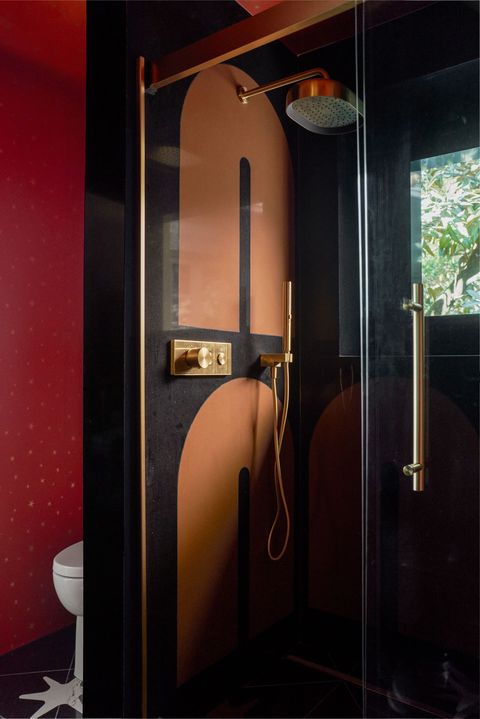
Serena & Lily’s whimsical persimmon wallpaper ignited the space’s out-of-this-world scheme. An ethereal, sorbet-hued glow from the shapely Lightology flush mount bounces off the high-gloss ceiling (in Benjamin Moore’s Dragon’s Blood) and the gold metallic stars. The extraterrestrial motif continues on the floor with interlaid quartz stars by Cambria. “I wanted to totally immerse guests in the stars,” she says. The horseshoe-shaped quartz motif, also by Cambria, on the shower walls “are a nod to the current curve craze.”
Lucinda Loya Interiors’ “Portrait of a Woman”
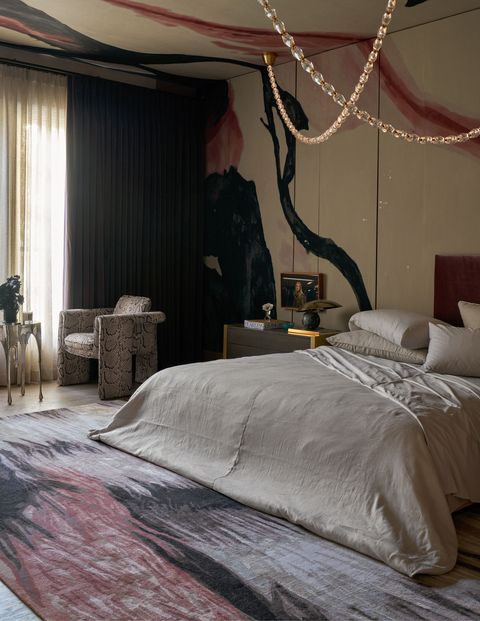
Houston-based design Lucinda Loya dedicated her bedroom design to empowered women of the past, present, and future. “Whether greeting the day or bringing one to a close, she is surrounded by intonations of unexpected color, pattern, and texture that gently urge, ‘Be bold, be strong, be fearless,’” she says. “I blended subtle, nuanced hues with stronger patterns and textures to create a warm, inviting environment that celebrates femininity and strength.”
A 1970s-inspired, hand-knotted silk-and-wool shag carpet from The Rug Company anchors Loya’s vision, with a brush stroke pattern of mauve, black, dusty rose, and champagne hues. Like an opulent jewel, the bed is upholstered in a frosted rose velvet and outfitted in platinum Peacock Alley linens. An asymmetrical headboard reveals a Porter Teleo wallcovering, its hand-painted abstract pattern climbing up to the ceiling. Reminiscent of a diamond necklace, a glass-and-brass chain-like chandelier from Circa Lighting makes a glamorous statement above the bed. Silver and plum velvet draperies by The Shade Store add an elegant layer.
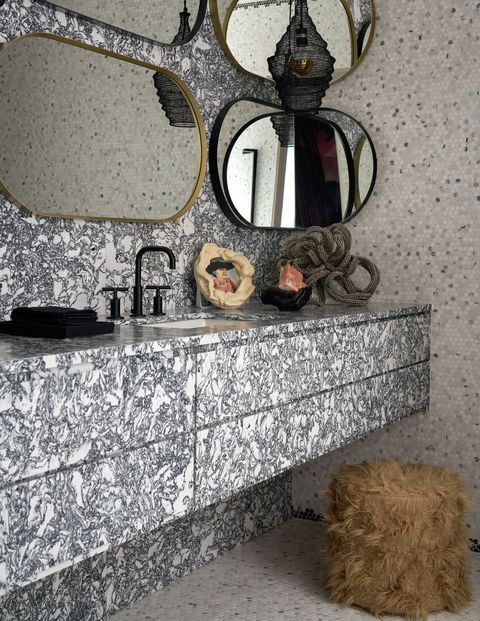
An adjoining bathroom features a boldly veined black-and-white quartz vanity (Cambria’s Rosebay Matte)and backsplash adorned with a set of nine oval mirrors and Kohler plumbing fixtures.
Avrea & Company’s “Pretty in Plaid”
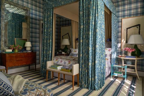
While flipping through a book of former Kips Bay showhouses, a room designed by Mario Buatta in the 1980s featuring Pierre Frey’s La Manach Batik Bleu struck Ashley Cathey of Dallas-based Avrea & Company with a flash of inspiration. “We envisioned a fresh, modernized take on his classic room,” says Cathey. Bedecking the canopy in the cerulean, Indonesian-style textile established the bed as the room’s focal point. The interior Rose Cummings purple windowpane check draperies, along with lavender floral D. Porthault bedding, lends visual contrast.
Kravet’s Mulberry Ancient Tartan in Teal wallpaper extends across the ceiling. “We love using plaid in all our designs for its sophistication and how it adds a masculine touch to otherwise feminine looks.” A hand-sculpted plaster chandelier by Stephen Antonson (from Wells Abbott) crowns the space. Underfoot, a striped rug designed in collaboration with From Jaipur with Love unites the bedroom’s palette.
Patricia McLean Interiors’ “Travelers Retreat”
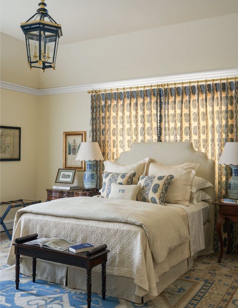
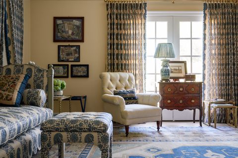
Patricia McLean’s concept for reimagining a tucked-away corner bedroom came from sojourns across the world. “What designer isn’t inspired by her travels? To me, it lends a good juxtaposition of sources,” says the Atlanta-based designer, who used Soane Britain’s lively hand-printed Paisley Stripe fabric to kickstart her scheme. “I decided to treat it as a toile and use it everywhere,” says McLean, who costumed three walls in draperies (fabricated by The Shade Store) featuring the pattern and adorned with beaded and pom-pom trims.
The bed, dressed in a creamy patterned silk matelassé and a linen duvet from Peacock Alley, beckons jet-lagged travelers while an Oushak rug helps establish the room’s cream and lapis palette. “Old rugs lend a calm to a room like nothing else,” says the designer. Antique tufted chairs (covered in a sandy Perennials fabric) create an additional seating area for tete-a-tete. Accessories like the French barometer hanging over the mirror, maps of Italy from William Word Fine Antiques, and a trompe l’oeil collage of Grand Tour souvenirs from Wolf Hall Antiques take visitors on far-flung journeys across the world.
M+M Interior Design’s “Reading Room”
Furnishing the 1,000-square-foot loft initially presented a challenge for M+M Interior Design’s Leslie Martin and Kim Meardon. Imagining how they’d utilize this area for their own families sparked inspiration for the duo. “During the COVID-19 pandemic, we all became homebodies. Our spaces must be ready for us to utilize to the best of their ability going forward,” says Martin. The team then devised a family-friendly escape from technology where the beauty of books could reign.
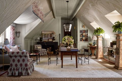
Inspired by René Lalique 1920s chiseled glassware, billowy ferns climb the vaulted ceiling on Iksel’s Deco Fern wallpaper, created in a custom taupe colorway to match the wainscotting (painted Coastal Fog by Benjamin Moore) wrapping the room. “It tells a story as you move through the space,” says Martin. Not even the “fifth wall” goes untouched, with latticework crisscrossing the ceiling’s center. The team enlivened the soothing backdrop with a palette of fresh French blue and juicy cranberry, plus a flurry of florals, stripes, ikats, and block prints for a curated look.
“In a room of this size, you have to address every single nook and cranny or else it feels like a roller rink,” jokes Martin. The solution came in a series of inviting seating areas that unfold like chapters, such as the 18th-century walnut trestle table for homework or sociable slipper chairs—covered in a playful Penny Morrison floral—perched in front of the black marble fireplace by Strike for cocktail hour. Perhaps the coziest cranny of them all is the cornflower blue sofa nestled in an alcove and situated underneath a custom canopy of florals and Perennials ticking stripes (fabricated by The Shade Store) that’s reminiscent of a Moroccan cabana.
“We didn’t want it to look decorated; we wanted it to look collected,” says Martin. Bookshelves filled with antique tchotchkes and collections of books—in addition to abstract artwork by Catherine Booker Jones and modern photographs by Dale Goffigon—add a final layer of storytelling.
Project AZ’s “Southern Sanctuary”
Ahmad AbouZanat of New York-based PROJECT AZ sought to re-conceptualize stereotypically sterile personal wellness rooms by designing a retreat infused with his favorite shades of purples, reds, and pinks. “This home sanctuary is packed with bright and playful colors that inspire inner joy, peace, and highly personalized moments of refuge,” he says.
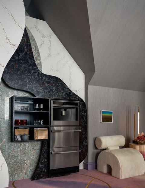
AbouZanat collaborated with JD Staron to design a shade-shifting custom carpet that ushers guests into a series of restorative spaces. A midnight blue ground greets guests in the “foyer,” where sculptural branches of a Luke Lamp Co. fixture illuminate a conceptual red acrylic drawing by artist William Perez (through the Thomas Nickles Project). As the carpet transitions into saturated reds and purples, visitors follow the arching gold lines to the JennAir coffee bar, which is built into a graphic wall installation of four veiny Cambria patterns.
Slender sweeps of gold deliver guests to a tranquil lounge, where the carpet’s background fades to soothing lavenders with whimsical florals inspired by Andy Warhol. “The color violet inspires a sense of spiritual well-being,” AbouZanat adds. Beneath architectural velvet valances and lilac Roman shades (both fabricated by The Shade Store), the pale pink serpentine sofa by DeMuro Das features “inviting curves intended to cradle a body in repose,” the designer says. Tucked behind a velvet curtain, a secluded meditation area, anchored by a custom bench, offers a quieter moment of contemplation.
Harold Leidner’s Landscaping
The 2022 Kips Bay Decorators Show House Dallas marked a happy homecoming for local landscape architect Harold Leidner of Harold Leidner Company, who designed the property’s original grounds some 25 years ago. “It was one of my first clients who allowed me to do a big estate back then,” he says. Returning to the familiar Old Preston Hollow home, Leidner set out to restore the grounds’ southern charm.
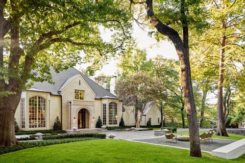
A former horse farm, the property was surrounded by a rustic timber fence. Leidner redesigned the fence and front gate with details that mimic the home’s paneled brickwork for a refreshed, modern look. “The entrance offers a formal sense of arrival,” he says, noting a cobblestone driveway that leads to the live oak-shaded bluestone motor court. “As you move further away from the front entry’s clipped greens, the property eases into a casual country landscape.”
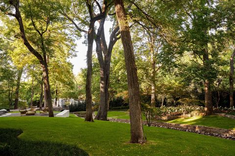
Restoring the creek (an element of his initial design) remained at the top of Leidner’s to-do list. “It’s the main attraction. The creek is the cake, and we added a little icing around it,” he says. The peaceful waterway flows from the front to the back of the house. “The home is built close to the massive trees, so it gives you a feeling of being on the San Antonio River Walk,” says Leidner of the back landscaping. Thinning the overgrown ground covering and designing a plaza off the motor court achieved his goal of enhancing the creek’s visibility and accessibility. “The sitting area invites you to engage with what’s happening beyond the driveway,” he says.

